jupyter_matplotlib
安装:
$pip install matplotlib
$jupyter notebook
1

2

import matplotlib

print(matplotlib.get_backend())
module://ipykernel.pylab.backend_inline
1
2
3
4
5
6
import matplotlib.pyplot as plt
import numpy as np
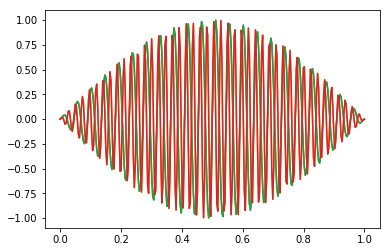
x=np.linspace(0,1,300)
for w in range(2,6,2):
plt.plot(x,np.sin(np.pi*x)*np.sin(22*w*np.pi*x))
plt.show()
1
2
3
4
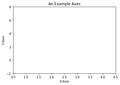
fig = plt.figure()
ax = fig.add_subplot(111) # We'll explain the "111" later. Basically, 1 row and 1 column.
ax.set(xlim=[0.5, 4.5], ylim=[-2, 8], title='An Example Axes', ylabel='Y-Axis', xlabel='X-Axis')
plt.show()
1
2
3
4
5
6
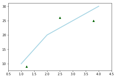
fig = plt.figure()
ax = fig.add_subplot(111)
ax.plot([1, 2, 3, 4], [10, 20, 25, 30], color='lightblue', linewidth=3)#绘制线
ax.scatter([0.3, 3.8, 1.2, 2.5], [11, 25, 9, 26], color='darkgreen', marker='^')#绘制散点图
ax.set_xlim(0.5, 4.5)
plt.show()
1
2
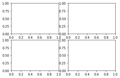
fig, axes = plt.subplots(nrows=2, ncols=2)
plt.show()